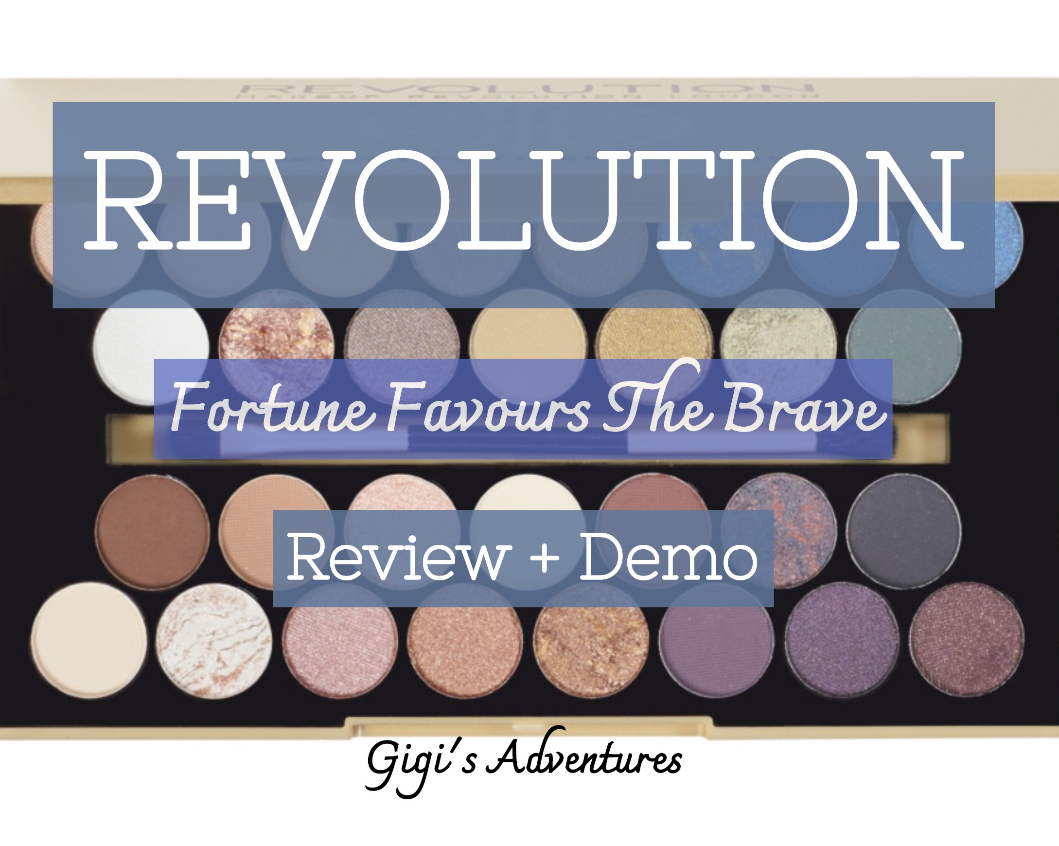
Revisiting Revolution Fortune Favours The Brave Palette | Review + Demo
Hey, pretty people!
Following my Revisiting Series, I am reviewing the Fortune Favours The Brave palette by Makeup Revolution once again. Fun fact: this product was also featured in my Top 10 Favorite Half Warm-Toned Half Cool-Toned Palettes!
This item features a total of 30 eyeshadows, which is quite a lot, and a double-sided brush. The selection is full of cool tones, but presents a few warmer ones as well.
Also, know that I took inspiration for the beautiful Samantha Jaelle to create this series.
So, would I still repurchase the Fortune Favours The Brave palette? Let’s find out!
Do you want to literally glow up overnight using the Light Feminine method? Click here!
GENERAL SPECIFICS
- 15$ | 9.99£ | 11.99€
- 30 shades
- 5 baked shades + 11 matte shades + 14 shimmer shades
- 56 oz. total Net Weight | 15.8 g
- Vegan
- Cruelty-free
- Gluten-free
- Full-size mirror
- Brush-equipped
- Versatile shade range, but mainly cool tones
Find the full lists of ingredients on revolutionbeauty.com and ulta.com.
PACKAGING
 For this palette to contain 30 eyeshadows, it’s fairly compact!
The frosted matte gold makes the black writings pop, but the shiny gold design gets kind of lost. The name of the product and the brand can be seen very well, but it’s such a pity the drawing rubs away so easily.
On the back, we find the usual black sticker with all the general infos of the product – like the ingredients’ list and such.
The palette opens and closes very well, even if it’s not magnetic; however, if you plan to travel, you might want to use some tape!
Opening up the product, we can see the full size mirror right away; in all honesty, this is one of the best features of the palette! You can easily complete your entire routine with it, and it’s very high quality.
I find the black background to be the best choice, since it pairs really well with the gold packaging. Also, it keeps the aesthetics and the color selection cohesive.
SHADES’ SELECTION + BREAKDOWN
If you love cool tones, this is the palette for you!

The selection spaces between more neutral colors up to sultry and deep colors; the overall balance between mattes and shimmers is good, but know the shimmers overpower the opaque shades a bit.
One thing that is missing from this palette is a proper transition for deeper complexions; to be fair, you don’t really have that many crease colors for any skintone! However, there is a matte black – which is especially good for dark complexions.
Another detail worth mentioning is that you get to play with many different formulas – especially shimmer-wise. Besides the usual shimmers, there are also a satin finish (which is basically a soft shimmer) and a baked one.
One aspect I don’t really fully enjoy about this color selection is the over-abundance of purple shades. I would gladly have done it without at least one of them, and substitute it with a proper transition for deep skintones.
ROW #1
![]()
Glimmer. This shimmer has a light beige base, but gives off slight baby pink hues. It’s a very nice and natural highlighter for lighter complexions, but could easily serve as a bright inner corner spotlight for deeper ones. It’s not the most pigmented shimmer of the palette, but has a very nice and smooth formulation.
Buffer. I personally like to use this matte mauve shade as an everyday transition, and it works wonderfully for lighter skintones. It’s really nicely pigmented, and blends out very well; the only thing I didn’t fully appreciate about it is the fact that blending it out lessens its pigmentation quite a bit. Other than this, it’s a pretty neat shadow!
Peachy. This peachy gold shimmer reminds me a lot of ‘Mai Tai‘ from Makeup Geek, just a little less strong and with a weaker duo-chrome element. One thing I was able to appreciate about it is that it looks less bright and more natural on the eye than it does in the pan. Once again, not the best pigmented one – but with a smooth and cohesive formula.
Hope. A taupey shimmer that finally has the pigmentation you’re looking for; actually, its finish reminds me quite a bit of a metallic one. It would be the perfect natural lid shade for medium skintones, but could be a nice highlighter for deeper ones. Its texture is even smoother than the others, and glides on the lid effortelessly.
Fortune. This is one of my favorite shimmers of the palette, and not just because of its color! This golden olive is really nicely pigmented, and has one of the softest textures. It’s one of the most reflective shades here, and I can’t wait to use it more this fall!
Skylight. The first baked shadow we encounter is a marbled blue and gold one; needless to say, it looks very tempting in the pan! It has a very light texture, which is more than normal when it comes to baked shades, but it does not have the best pigmentation; also, it looks a lot lighter on the eye than it does in the pan.
Transformer. The thing about this deep matte blue shade is that it’s a pretty amazing shadow, but it creates a whole lot of build-up in the pan. The pigmentation is simply outstanding, one of the best of the palette, and blends out very quickly without losing too much power; however, it’s better to proceed with a more cautious hand!
Midnight Rainbow. Let’s get on with another blue, the perfect marriage between ‘Skylight‘ and ‘Transformer‘ if you ask me. It has a very deep blue base, and gives off beautiful light blue reflexes. Truthfully, as beautiful as it looks in the pan, it does not have the best pigmentation ever; thankfully, building it up does not create texture on the lid.
ROW #2
![]()
Ice Cloud. This pure white shimmer is the perfect soft highighter for lighter skintones! The pigmentation isn’t very good, but this makes it a good spotlight for darker complexions as well; on the other hand, the formula is soft and smooth.
Golden Coins. The second baked shadow we encounter is a lot more satisfying to work with than ‘Skylight‘, thankfully! This rusty orange gives off subtle golden particles, and its pigmentation is simply spectacular. Formulation-wise, it’s smooth and soft, and a true pleasure to work with.
Cashmere. This taupe shimmer with gold particles isn’t really my favorite shade of the palette; it has more to do with the actual color of it, rather than the formula. It has an overall ok pigmentation to it, although it’s really nothing special; when it comes to finish, I personally feel like it’s more of a satin rather than a proper shimmer.
Tip Top. This matte cocky green is undoubtedly beautiful in the pan, but it always takes me a little bit of work to have my brush pick it up. It lays down well on the eye though, and blends out quite nicely as well; it doesn’t create any build-up in the pan, which is great since you will need to do a little bit of swirling.
Yes Please. This olive shimmer looks quite similar to ‘Fortune’, but a but darker and with a stronger green base; the golden particles are also a bit stronger, but once swatched you will see that these two shades are quite different. It’s one of the most pigmented shadows of the palette, and has a smooth and soft formulation.
Green Machine. This leafey green is another baked shadow, and another one that has golden particles in it; this time, however, are more subtle and toned down. It tends to lean towards the lighter side, so darker complexions may need a lighter base underneath to make it pop.
Smoothie. This matte cool deep green is truly a very beautiful shade, and it works perfectly with ‘Transformer‘ from before. It’s beautifully pigmented, and does not lose any power after blending it out; also, it blends out pretty well!
ROW #3
![]()
Caffeine Fix. This matte brown shade looks a bit deeper in the pan than it does on the eye, that’s for sure! The color picks up nicely and lays down well, and preserves its pigmentation through blending; the only thing to note is that it looks a more chocolate-y and warm on the eye than it does in the pan. Other than this, it could be the perfect transition/base for medium or darker complexions!
Latte. I personally like to use this beige-y light brown as an everyday matte transition, but I feel like it could work as a nice base for more medium skintones as well. It stays true to what it looks like in the pan. It has an overall nice pigmentation to it, and blends out quite well.
Pink Diamond. This shade reminds me quite a bit of ‘Pink Champagne‘ from the Soph x Revolution palette, but its baby pink game is a lot stronger. It’s not the most pigmented shimmer here, but it’s very soft and glides on the lid effortelessly.
Crème. This very light beige could be the perfect base for lighter skintones, but I would advise you that it has more of a satin finish rather than a matte one. To be honest, this shadow isn’t really anything too special; it hasn’t the best pigmentation, and tends to look a little bit shiny as well.
Drama Queen. A matte purple that seems to have a wine element to it, at least in the pan; in fact, once the product is layed down and blended, it loses basically all of its wine undertone and becomes a proper purple. The pigmentation is quite good, and it remains strong even after blending; it’s not my favorite color ever, but it performs quite well!
Lonely Planet. This baked eyeshadow looks like a blend between blue, purple and black in the pan, but once swatched it turns into a true charchoal black. This is marvelous if you have a lighter complexion and don’t really feel like digging into a proper matte black!
Blacqua. I really appreciate when palettes feature a matte black with a neutral undertone, especially if there aren’t many transitions for deeper skintones. This shade has to be approached carefully, mainly because it’s really pigmented! It blends out really well, and does not loose too much power while doing that.
ROW #4
![]()
Soft. If your complexion leans towards the lighter side, this will most likely be your go-to base; just know it’s a little bit bright, though! It lays down on the eye nicely, and has a very good pigmentation to it.
New World. This baked white and gold shade is one of my favorite highlighters ever! It’s truly nicely pigmented, and lays down on the face/lid without creating any type of texture. Instead, it blends quite naturally with the skin – making the golden particles pop but not too much.
Favour. A super pigmented dusty rose shimmer! This shadow is a real pleasure to work with: it’s not only pigmented, but also smooth and super soft. Also, it looks a little bit brighter on the eye than it does in the pan.
Sunset Hour. This orange shimmer looks similar to ‘Golden Coins‘, but the rusty element gets almost completely lost. Also, the lighter orange/gold particles are more toned down. Unfortunately, it’s not as pigmented as the baked shade. However, it’s very soft and has a smooth texture to it!
Super Gold. Even though this shade is named ‘Super Gold‘, I think it has a more brown base to it. However, the golden particles are still very much present. This baked shadow truly has a nice pigment to it, and one of the smoothest finishes as well!
Winning. It looks slightly darker than ‘Drama Queen‘ in the pan, but once applied and blended it out it becomes exactly the same. I don’t really have anything bad to say about it, but there’s nothing too special about it either. It has a good pigmentation and blendability to it, but truthfully it didn’t make a big impact.
Brave. This shimmer looks like a blend between black and purple in the pan, but it turns into a charcoal black once swatched. Sadly, it’s one of the shadows I disliked the most. I find this shade to be quite dry, and the purple element gets completely lost once it’s applied to the eye. It’s not very pigmented either. To be honest, I find it to be quite useless.
The Revolution. This maroon/purple shimmer is another shade that disappointed me quite a bit. It does not have the best pigmentation, and once swatched it turns almost completely black; also, its purple particles get completely lost whilst applying.
DEMO #1

After priming my eyes and setting it with some translucent powder, I buffed ‘Tip Top‘ in the innermost part of my crease, followed by ‘Smoothie‘ in the center and ‘Transformer‘ in the outer one. Then, I cut the crease creating a sort of elongated shape and set it with ‘Soft‘. Lastly, I swiped whatever was left on my brush on my lower lash line, and used ‘New World‘.
DEMO #2

On a primed and set lid, I swiped ‘Buffer‘ a little over my crease, and ‘Transformer‘ directly under it. After a little bit of blending, I cut the crease halfway through and set it with ‘Favour‘. Then, I used a bit of ‘Midnight Rainbow‘ to connect it with ‘Transformer‘. Lastly, after buffing the crease colors on my lower lash line, I placed ‘Drama Queen‘ in my inner corner.
DEMO #3

On a primed and set lid, I started defining my outer corner and crease with ‘Drama Queen‘, subsequently blending it out with ‘Tip Top‘. Then, after cutting the lid halfway through, I set the inner part with ‘Fortune‘ and the center with ‘Yes Please‘. After that, I connected the shimmers to the purple with a tiny bit of ‘Winning‘. Lastly, I swiped the crease colors on my lower lash line and used ‘New World‘ as my inner corner highlighter.
Before Wrapping Up: The Brush

 One thing I glossed over throughout this post is the presence of a double-sided brush.
The tool isn’t all that big, let’s be real, and it’s also a pretty sensitive one. Just know that I had to put tape on both ends only a couple of weeks after getting the product.
Let’s get into a deeper analysis of each side – starting from the flat definer one. It looks very small and more compact when compared to your ‘regular’ flat brush, and it’s perfect for cut creases and more precise looks. Also, it picks up more product than a bigger brush – which is great when it comes to less pigmented shades.
The ‘fluffy’ end, on the other hand, is a much more tricky story. If you plan to use it into your crease, I would highly suggest you don’t. It’s a bit harsh and scratchy, and will create more of a defined look rather than a softer and blended one. That being said, this aspect makes it fit for defining the lower lash line and creating more precise cut creases.
FINAL THOUGHTS
 Like always, it’s been a long review! All in all, would I still repurchase the Fortune Favours The Brave palette by Revolution? I would!
I know I said that some of the shades were not all that special, but I have to admit that for this price I can’t really complain. Also, a total of 30 shades is a lot!
This color scheme is kind of a breath of fresh air, even if it’s not the newest one on the market. Cool tones are making a comeback, and this palette is a great way to get started with them.
What I did not fully enjoy about it is the lack of proper transitions for deeper skintones. This lack is partially compensated by the matte black, but let’s be real: it’s not enough.
Another aspect that did not set too well with me is the over abundance of purple shades. They are way too many of them in my opinion, and they all look very similar to each other.
Overall, I think this palette is 100% worth its price. It has a somewhat cohesive formula to it, with a decent pigmentation and a good blendability; a few shades do not give their all, but that’s ok. We can’t always win them all, especially with this many shadows!


